Production Management Project
Doing work for Salvador Dali was intense due to the work load which had been put on us. It was essential that we created some sort of schedule or timetable to make sure that we were on track all the time. It was a course task that we all created a production schedule but I went one step further into creating a more in-depth production log where I including the programmes needed for each task, estimated time needed to complete the task but only for certain projects which were more time consuming than the others. Below is a screen grab of my Production Schedule and the side Production in more detail which I later created.
The first production log just simply shows the viewer how I allocated my time but the second production log was one which set myself targets to complete the tasks in a time I had predicted for my self.
After completeing a task I would instantly refeer my work to a teacher to have a look so I may know their verdict or anything else to add to it so I may go back and improve. Also as you go down my blog and look through the projects, you may see how my posts are presented; it gives the viewer a sense of how I completed and manged my work well from addressing the assignment to showing how the assignment was executed using a range of different techniques on a range of programmes from Photoshop a digital image manipulator to Sony Sound Forge which is an audio editing software used by proffesionals.
Digital Graphics for Interactive Media
For our new assignment we were instructed to produce a series of 3 Flash, Adobe or Photoshop graphics based on any of our pre-production work that can be used as a standard sized web advert. We were then given a sheet explaining the guidelines on the sizing details in pixels. I instantly thought of use of banners across the internet so I then went on websites such as YouTube and recognised the banners which 'pop up' whilst a video is being watched; websites such as Gametrailers.com had animated web banners going across the screen. I also went on sites such as IGN as they have both animated and still web banners not only across their homepage but along they site.
As you may see, they have a flash a banner which scrolls along different headlines after a few seconds. Below that they have a leader board banner displaying the upcoming event of E3 whilst to the right of that they have another banner displaying a movie which is soon coming out called Mother’s Day. The type of banner I wanted to make was the same type of ‘pop under’ banner which IGN had of doctor who.
I then took notes from this to create two animations and a Photoshop still. I based the foundation look of my web graphics on the front cover of house music group, Daft Punk's album cover for Discovery as shown below.
I was inspired by its funky font and the texture of the design. This urged me to find a similar font which I could create a web graphic from. I then found the perfect font and gave it my own design look. I firstly created the first graphic as a still in Photoshop before taken it over to Adobe After Effects so I could animate it. Below is the result of how all of the inspiration which I researched over the internet helped me to create.
With this design I wanted to modernise the look of Dali whilst still preserving the time gap. I integrated the new logo’s and design of the ‘ChupaChups’ advertisement which can be seen on the bottom two banners and also which I have pasted below.
I mixed these new advertisements of ChupaChups along with old pictures of Dali dating from his early life to around the time of his death.
Graphic Narrative Production
We were then given an assignment to create a digital storyboard which shows the plan for our final animation. We were then instructed to create another set of idents based on one of our three ideas originally mapped out for our final media project. Below is a plan for the three original ideas I had for a final media production.
This first idea was created based on the painting by Dali called 'Woman in Window'. The aim of the ident is to take the viewer through a gallery of Dali's artwork whilst maintaining a storyline. This was to be created on Adobe After Effects. The first frame began with the painting; woman in the window along with the backdrop as Dali’s other painting; the last Supper. A 3D animated butterfly would then make its way onto the scene whilst I take the viewer through a range of Dali’s work blending and mixing his work together creating illusions as you can see on the last three frames.
Above is a part of my second story board on which I planned to create. It features the crucifix painting by Dali which then evolves into many of the classic block games such as 'Tetris', 'Pong' and 'Snake'. I wanted to show how just one of Dali’s paintings could evolve in to so much more. I was also pressing more on modernising Dali’s work as I did with the Web banners. I did not just want to keep Dali’s work surreal but I wanted to take it from its old age and make it interesting to younger viewers of today.
The third initial idea for a storyboard was one from which my web banner in my previous post originated from. It was going to feature just the name of Salvador Dali which a smooth design to it whilst images of his famous paintings blended in with the back ground.
I wanted to create the text in 3D whilst animating the lights whilst probably introducing images of Dali in the back which will be transparent unless light is shined upon them.
Motion Graphics & Compositing
Another task we had was t create two short sequences of compositing using programmes such Autodesk Maya and Autodesk Combustion. They had to consist of the words Dali Surrealism or Gaudi and Architecture. Recently upon creating the Gaudi ident, we then had to create a piece of motion graphics. Motion graphics are graphics that use video or animation technology to create the illusion of movement or motion. In this case we just had to create two pieces, one featuring the title, 'Dali & Surrealism' and the second featuring 'Gaudi & Architecture'
Originally I opted for something flashy and high tech seeing as my FMP is a high tech theme. I tried to make as much use of lighting as I could to create something both dark and futuristic. Below are previews of what I created. Unfortunately, Maya did not let me render this so I had to make another piece.
Originally I opted for something flashy and high tech seeing as my FMP is a high tech theme. I tried to make as much use of lighting as I could to create something both dark and futuristic. Below are previews of what I created. Unfortunately, Maya did not let me render this so I had to make another piece.
I then created these simple pieces whilst being cautious of what my Maya could handle. So I looked online for chrome or metal textures to add to my new piece of text. I then rendered the scene before looking online for a background to place the text upon.
3D Animation
When creating my 3D animation, I had to make it look identical to what I had predicted in my story board. I gathered information and images from the cinema Movie Tron as I wanted to create a similar scene.
I chose Tron as inspiration for my animation because it is very futuristic and is not only just modern but is the future. One of my main points with the Dali Project has been to modernise Dali as much as I could. I then went into Photoshop I began to create a pattern of which I could use as a texture for the flooring in Maya. I then first created my environment which looks similar to one which you may find in a Tron movie. I included glow techniques which the creators of Tron included with a dark backdrop.
I used a lot of different textures to create the sort o f effect I wanted to capture. For the pillars I used the material ‘Phong E’ because with this texture you can more easily edit the shine and reflective effects this material holds also it was better because I could further edit the translucency so the glowing lines could flow through whilst looking realistic. I used an immense amount of lighting to capture the sci-fi scene. In a normal scene the lighting would have to equal 1. I went beyond that and gave some of my objects that extra glow to insure that the viewer would not view this as a place on earth but rather more as a game or a scene from another realm.
Another thing which inspired me about the architecture of the scene was the architecture of Antonio Gaudi. His buildings were not ordinary and also gave you a surreal horror/Goth feel. You could imagine many of his buildings being used as a scene in a horror Hollywood movie. I wanted to create a scene where you wouldn’t want to be alone at night.
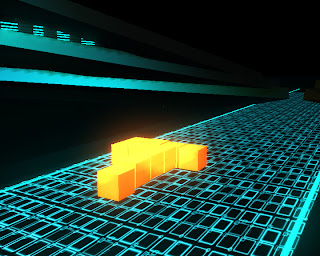
Next I began to create the blocks. I used a Lambert texture for each block whilst including glow and increasing the transparency just a bit. I then set a formation of the blocks so that it matches the painting called the crucifix.
I then began to animate some of blocks individually, taking the blocks through different games such as Nokia’s Snake and Tetris.
The above pictures show Tetris, Snake and Pong. After animating I then rendered my sequence to the settings of:
Environments
As I mention before, when creating my 3D animation, I had to make it look identical as I possibly could to what I had predicted in my story board and to the movie Tron.
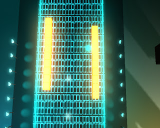
Tron has looks very futuristic and does not look like it is based on Earth even though it features humans. One of my main points with the Dali Project has been to modernise Dali as much as I could. I then went into Photoshop I began to create a pattern of which I could use as a texture for the flooring in Maya which can be seen below.
I then set this material to fit onto the main road with lamps lit across the road which created a passage way to the focal point of the scene which was a big building in the back. The movie Tron has a similar look with a long road leading up to the building in the back.
I then added bridges with architecture and a few ambient lights to finish off the scene. I wanted to split my environment into two, one side being orange and the other side blue.
I hope that my scene looks both sci-fi and futuristic to the viewer whilst maintaining a surreal feel.


